



The right approach to web design is not just a technical decision; it’s a business strategy. In 2026, user experience is one of the most significant factors influencing your online success. Customers expect websites that look and work flawlessly on any device. If your site fails to deliver, they bounce. That's why “responsive design” and “adaptive design” are keywords you have probably heard from your developer or marketing agency. But which approach makes the most sense for your business this year? Let’s discuss.
What Is Responsive Design?
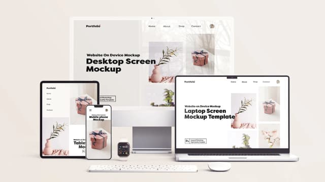
Responsive design creates a single flexible layout that automatically adjusts to fit the user’s screen, whether it’s a phone, tablet, laptop, or a large desktop monitor.
The same HTML code is used for all devices.
CSS and fluid grids help content adapt to different screen sizes.
Images and text scale proportionally, so nothing looks squished or blown out.
In practice, this means your web pages keep a consistent look and feel no matter how or where they are viewed. The benefit? You don’t have to build different versions for different devices, and users enjoy a seamless experience.
What About Adaptive Design?
Adaptive design takes a different path. Instead of one flexible layout, it delivers multiple fixed layouts for specific screen sizes. For example, you might have one for smartphones, one for tablets, and one for desktops.
Your website detects the user’s device and loads the matching layout.
Designs are tailored for each screen size, optimizing usability for that exact device.
It often requires more upfront work, but the results can be more targeted.
A restaurant site, for instance, could design mobile pages that highlight the menu and ordering system, while the desktop version showcases high-resolution gallery images and event booking details.
Why This Choice Matters for Your Business
In 2026, mobile traffic makes up over 58% of global web traffic. People jump between devices constantly, check a product on their phone, research on their laptop, and then buy on a tablet. If your site does not accommodate that reality effortlessly, you risk losing sales.
The choice between responsive and adaptive is not just about aesthetics. It’s about:
Conversion rates: A smooth experience keeps visitors moving toward purchase or inquiry.
SEO rankings: Google’s mobile-first indexing rewards sites that perform well on mobile.
Brand perception: A clunky or inconsistent site layout makes your brand look outdated.
Responsive vs. Adaptive: When to Use Each
Choose Responsive If:
You want a cost-effective way to deliver a consistent experience on all devices.
You don’t need hyper-specific layouts for different devices.
Your priority is easier ongoing maintenance.
Choose Adaptive If:
Your business benefits from a highly customized experience per device.
You need different functionalities or layouts for mobile vs. desktop audiences.
You have the budget and resources to manage multiple designs.
The SEO Angle
From an SEO standpoint, responsive design usually wins because Google explicitly recommends it. A single URL for all devices avoids duplicate content issues and simplifies crawling, and since speed matters, you can optimize a responsive site to load quickly across devices, which is critical for rankings and conversions.
Adaptive design can still perform well for SEO, but it demands careful technical implementation. You will need proper redirects and accurate user-agent detection to avoid confusion with search engines.
Emerging Trends in 2026
Several changes in technology and user behavior are influencing how businesses approach this decision:
Voice Search Growth: More people use smartphones for quick, spoken queries. Responsive design ensures consistent optimization across screen sizes where voice search results can appear.
High-Resolution Media Demands: Brands that use interactive features or 4K product images may prefer adaptive layouts to fine-tune visuals across devices.
AI-Powered Personalization: Sites are increasingly tailoring content in real-time based on device and user behavior, a space where adaptive approaches can shine.
Balancing User Experience and Business Goals
Here’s the bottom line: The “best” choice depends on what you are trying to achieve. If flexibility, SEO, and streamlined updates are most important, responsive is your friend. If you want to deliver specialized experiences for different audiences, adaptive gives you more control.
As a decision-maker, think about:
Who is visiting your site and from which devices?
Your budget for design and ongoing updates.
The speed requirements for your target audience.
Your long-term digital marketing goals.
Let’s say you are an e-commerce brand selling wearable technology. Your customers browse on their phones during commutes but prefer desktop for purchases. With adaptive design, your mobile layout could emphasize quick product details and “buy now” buttons, while desktop brings out rich product demos and side-by-side comparisons. For a small consultancy, though, responsive might be a better layout that works for your blog, services page, and contact form without needing multiple redesigns.
Final Advice for Businesses in 2026
Don’t treat this as a purely technical decision; it’s a customer experience choice. In digital marketing, your website is often the first serious handshake with a potential client or buyer. The wrong approach can make your site feel frustrating. The right one can lift your brand and boost conversions. Take time to audit your audience’s device usage and content needs. Discuss options with both your developer and your marketing team. See demos of both styles for your brand before committing.
Whether you go responsive or adaptive, the real win is delivering an experience that’s fast and designed around your users’ habits. Technology will keep evolving, but in 2026, meeting your audience where they are with the proper layout is one of the smartest investments you can make. Ready to make your website future-proof? Let’s talk about building a design that works for your business today and adapts for tomorrow.